


Search by your postcode to see your local situation.
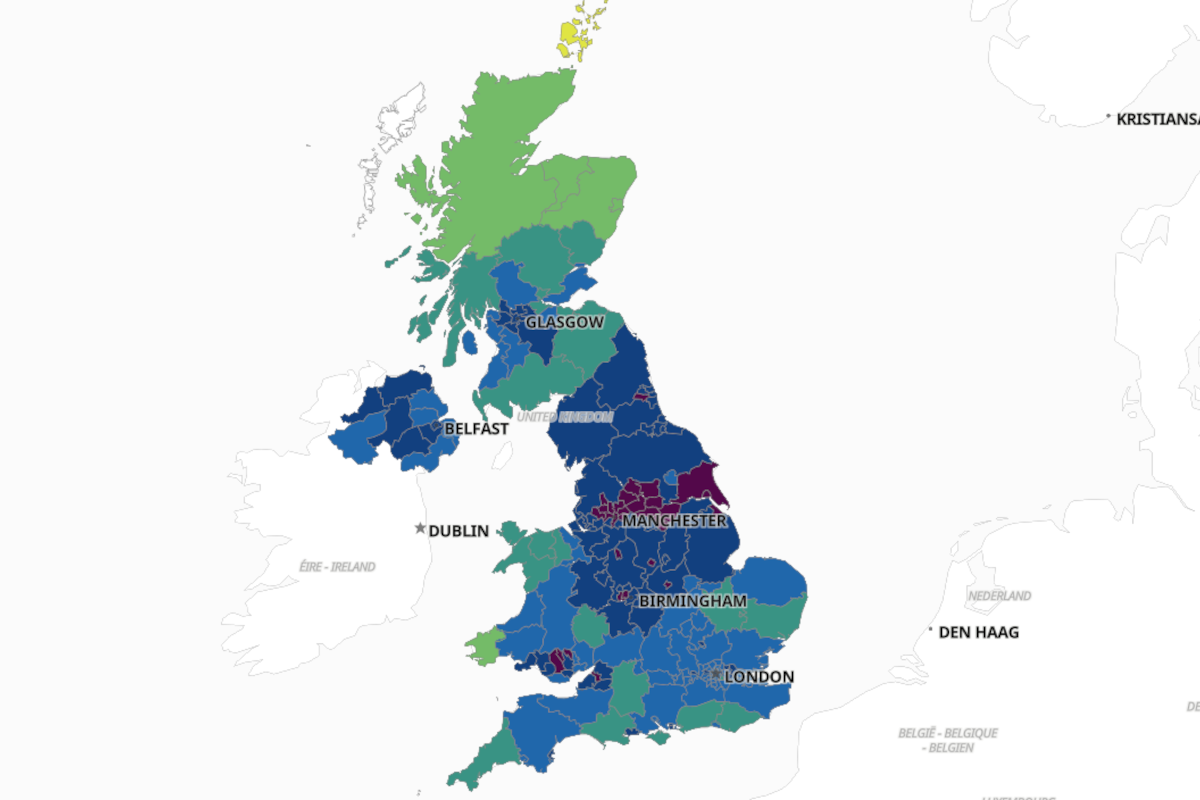
As the COVID Infection rate in the Scarborough Borough hits twice the national average an interactive map shows just where the hot spots are.
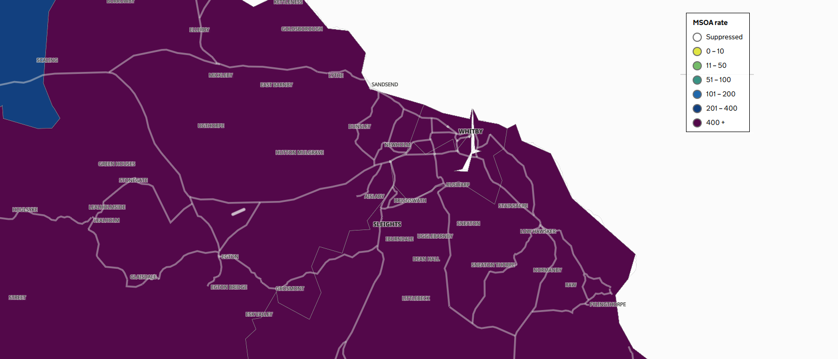
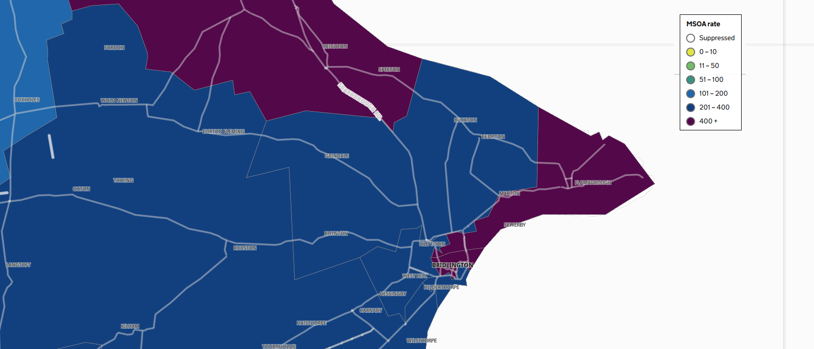
The map shows the seven day infection rates for different areas of the country. The seven–day rates are expressed per 100,000 population and are calculated by dividing the seven day count by the area population and multiplying by 100,000.
The map uses data from a number of reporting authorities. On an initial glance the map shows the data from Upper Tier Local Authorities (UTLA). This shows the entire Yorkshire Coast has being in the highest category of infection rate.
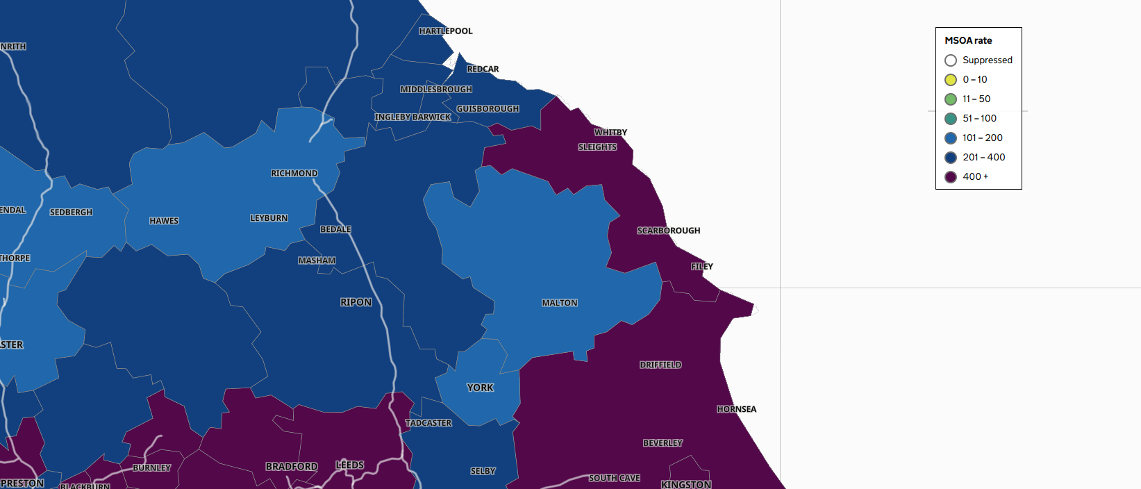
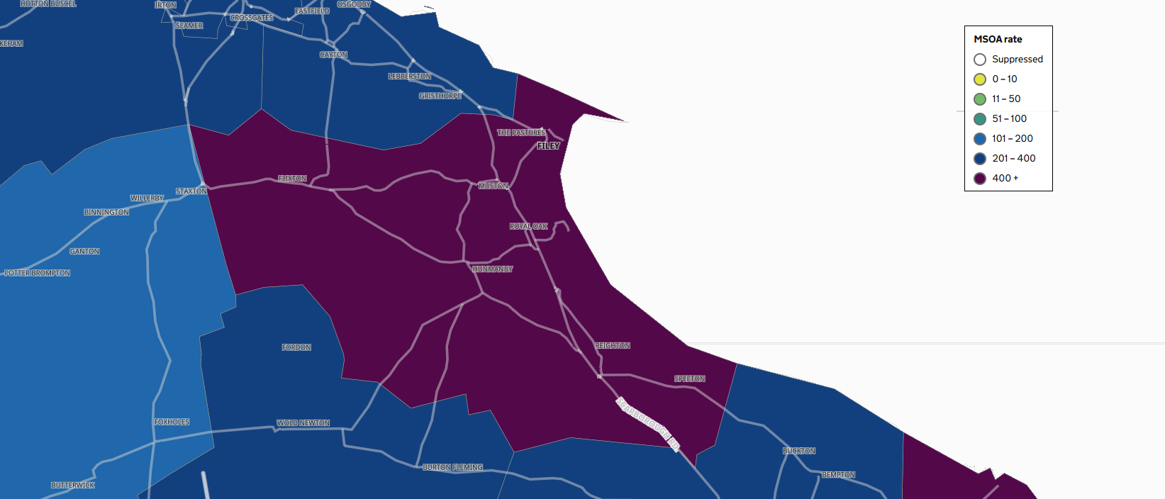
Bust as you zoom in to the map, more details emerge based on data from Lower Tier Local Authorities (LTLA) and Middle layer Super Output Areas (MSOA).
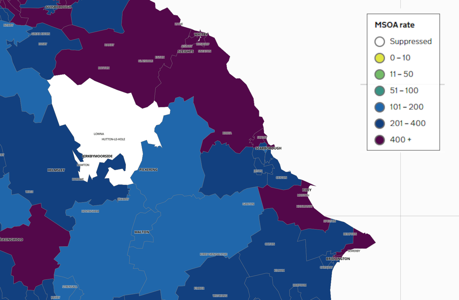
This begins to show the data in a more localised way and highlights where along the Yorkshire Coast the highest infection rates are being seen.
SCARBOROUGH

FILEY
WHITBY
BRIDLINGTON
The maps are being updated on a daily basis and you can scroll back through the data to see how the spread has changed overtime.
It's also possible to search the map by Postcode to see the situation where you live.

 North Yorkshire's Public Toilets are Threatened with Closure as New 50p Fee Proposed
 FLOOD WARNING Issued For Bridlington's Harbour Road Area
 Langdale Fire Funding- Scarborough & Whitby MP Asks Government Colleagues For Help
 'Big Plan' Sets Out Five Years of Funding in East Riding
 Scarborough Athletic Chief: Big Improvement Needed After Cup Exit
 No Delay for Burniston Gas Rig Decision
 Whitby Town Hope For Home Comforts After Poor Away Run
 Bridlington Town Back On The Road
 Scarborough and Brid Again Battle To Stay On Top
 Pickering Town Face West Yorkshire Trip
 Burniston Gas Well Plan Recommended for Approval Despite 1500 Objections
 East Riding Councillors Condemn ‘Punitive’ Government Funding Review as Council Faces £100 Million Shortfall